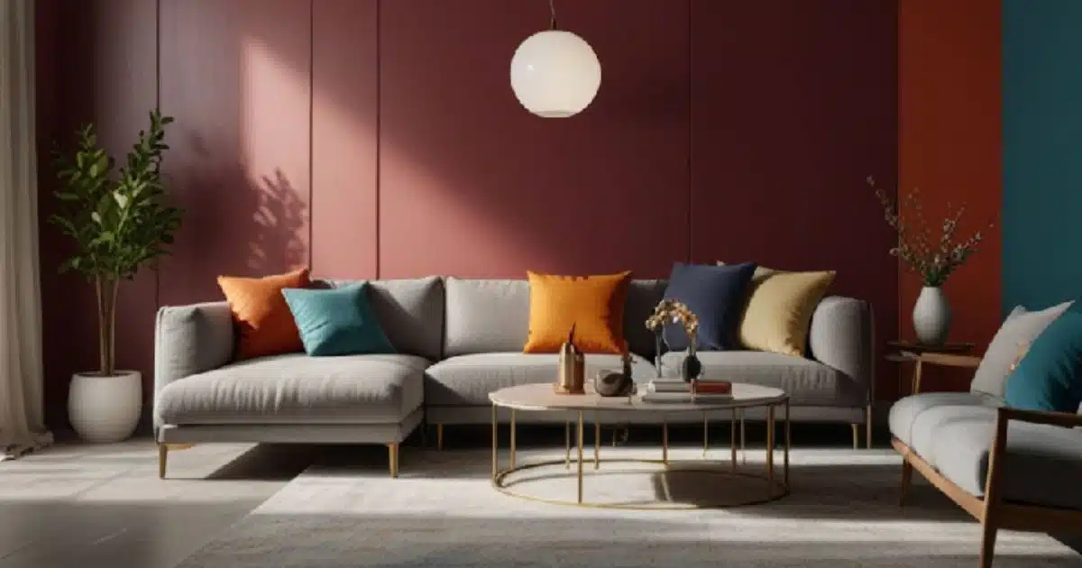
Have you ever wondered why there is such a big choice of colours for your interior design project? Colours do matter and picking the right colours for a particular space can make a big change in the feel of a place. Proper hue selection contributes to the formation of proper harmony, balance, and attractive appearance. With the help of this guide, you will be able to learn some basic rules and principles that are crucial when considering the colours for the chosen interior design theme.

Understanding Color Theory
However, to embark on the formulation of colour palette and relation in particular, it is requisite to have certain fundamental knowledge of colour theory.
- Primary Colours: Primary colours are, therefore, red, yellow, and blue. These are colours that cannot be produced by the mixture of other colours of matter.
- Secondary Colours: Orange, green, and purple form the category of secondary colours. They result from the combination of two primary colours.
- Tertiary Colours: Every primary colour, mixed together with a secondary colour, produces a tertiary colour.
- Analogous Colours: These are the colours next to each other in the colour list, including blue, green, and yellow.
- Complementary Colours: These are hues that are located on opposite sides of the colour wheel, for instance, red and green colours.
- Triadic Colors: These are color that are arranged in a triangular form with each side of the triangle having the same length, including red, yellow and blue and the like.

Choosing a Color Scheme
After understanding the basics of colour, you can look for choosing color schemes. Understanding these schemes is the first step; next, you can learn How to Choose Colours That Make Your Room Look Better by applying them practically to your specific space.
- Monochromatic: This scheme incorporates different varieties of a single colour including the different shades, tints, and tones. This results in a streamlined and aesthetically pleasing appearance.
- Analogous: It also gives a harmonious and pleasant appearance since the hues are taken adjacent on the wheel.
- Complementary: Such as pairing one hue with its complementary colour on the wheel which produces intensity and vibrant contrast.
- Triadic: The choice of colours that belong to an equilateral triangle on the colour wheel is very bright, bold and distinctive.
- Neutral: This scheme is centered on colorless such as white, black, grey, beige, and brown. It is simple and has been around for a long time; hence, can be used for almost any kind of design.
Factors to Consider
- Room Function: There is a specific reason for each room when it comes to interior design and renovation. For instance, a bedroom could need a more laid back tone as opposed to a living space that may require a dynamic feel.
- Personal Preferences: The selected colours should be complementary to your personality to ensure you get the best out of it. Select the paint colours that you like and feel comfortable.
- Natural Light: The intensity with which the natural light falls on a room is likely to determine the best colours to use. It is true that dark colours could absorb light, whereas lighter colours could reflect the same.
- Existing Elements: When choosing certain colours, it is important to evaluate that particular colour with your current furniture, pictures, or flooring.
Tips for Creating a Harmonious Color Palette
- Start with a Neutral Base: Applying neutral colours as the base can help create a versatile foundation that will be easily adaptable to the colour palette.
- Add Accents: Try to incorporate accent colours to your interior to make it more fun and unique.
- Create a Mood Board: This can be facilitated through a mood board, which will assist in coordinating colour schemes of the different components of the design.
- Test Colours: Use the colour on any small area of the room to see how they look in different lighting conditions
- Don't Be Afraid to Experiment: Proper use of colours is usually effective. It is advisable to mix things up and ‘test’ out the various possibilities to see which gives optimal results or close to your preference.
Conclusion
The use of colour in interior design is an artistic way of putting together the various components of your project. If you are able to take into consideration these factors and use the information from the colour theory, then you are sure to select the colour that is ideal for your personality and ensure you have the best and warm atmosphere in your home. Once you've mastered your colour palette, the next step is to channel it into a specific aesthetic. However, for complex spaces or whole-house projects, seeking

Recent Comments